Website Header
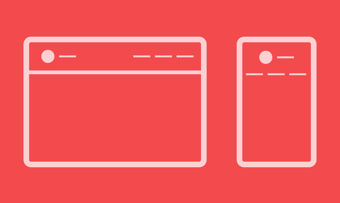
This is awesome! A logo to the left, a navigation to the right.
It's not a big deal, but this tip could save your time during a lot of projects.
Defining our needs
I think there are two ways to handle this kind of situation, but only CSS will change the game. My list of needs:
- A logo to the left, a navigation to the right,
- Logo and navigation have to be vertically centered,
- Horizontal alignement have to be shared between logo and nav
- When screen width becomes not enough for both in the same row, logo and nav have to be in two different centered-content lines.
- (Optional) When both are in the same line logo is stuck to the very left, nav to the very right
I put this last item as optionnal, because… it depends on the project you are doing, but the need can happens.
Let's code this
Our HTML basics
<header class="main-header">
	<div class="container">
		<h1 class="mh-logo">
			<img src="http://flexbox.ninja/assets/images/logo.svg" width="170" height="95" alt="Flexbox.ninja">
		</h1>
		<nav class="main-nav">
			<ul class="main-nav-list">
				<li>
					<a href="#">Home</a>
				</li>
				<li>
					<a href="#">About us</a>
				</li>
				<li>
					<a href="#">Our clients</a>
				</li>
				<li>
					<a href="#">Contact</a>
				</li>
			</ul>
		</nav>
	</div>
</header>
I use a lot of classes so you can easily chose your own markup.
In this case, the .container element is here to limit header content width in big screens.
CSS to flex the things
It's time to define the main rules that make this magic appears. Feel free to see the complete demo file to grab some other tips.
/**
 * Images a now responsive
 */
img {
	max-width: 100%;
	height: auto;
}

/**
 * Limit the container in
 * width for big screens
 */
.container {
	width: 960px;
	max-width: 100%;
	padding: 20px;
	margin: 0 auto;
}

/**
 * By using display: flex
 * Logo and nav are in 2 cols
 * align-items make them
 * vertically centered
 * justify-content distribute
 * horizontal spaces around
 * and flex-wrap break the
 * things in two lines in
 * small screens
 */
.main-header .container {
	display: flex;
	align-items: center;
	justify-content: space-around;
	flex-wrap: wrap;
}

/**
 * The followings are to
 * make things more
 * clean and airy
 * and contents centered
 */
.main-nav ul {
	margin: 1em 0 .5em;
	text-align: center;
}
.main-nav li {
	display: inline;
}
.main-nav a {
	display: inline-block;
	padding: .5em 1.5em;
}
Magic part is at .main-header .container selector with all the flex-things. With that, we don't have the last (optionnal) point of our list.
I propose to you an alternative by pointing only the differences in this following CSS code:
/**
 * Space-around become
 * Space-between to
 * distribute space
 * between the flex-items
 */
@media (min-width: 960px) {
	.main-header .container {
		justify-content: space-between;
	}
}
Here, the breakpoint is defined by the maximum width of my .container. I think it's an at-least value, but feel free to adjust it according to your project.